
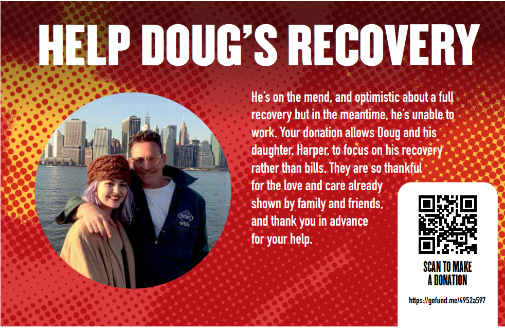
Visit this link to donate to help Doug’s recovery.
Doug Dobey: Master of Design
by Charles McGuigan 07.2022
Photos by Rebecca D’Angelo
A summer day in Bridgeport, Connecticut could last for close to an eternity if the weather was just right. Every moment of that kind of day—from the time the sun rose, until long after it slipped away into the lightning bug night—pulsed with enough sounds and sights and smells to fill a thousand lifetimes. In the car with his two older brothers and father, riding along Fairfield Avenue, he saw his own surname carved into the white sandstone of a gently curved building clad with glass bricks, which caused him a chill and a bolt of pride. At his grandparents’ home in the neighborhood of Black Rock, he would walk to the bank of Ash Creek, a tidal stream where gulls and egrets would feed. And when the tide went out, he could smell a combination of river rot and diesel fuel, and could see shopping carts and old tires embedded in the slick, blue-black mud. On the opposite shore rose ancient towers of industry, a small skyline of factories, and farther downstream was the Bullard factory with its giant oval logo slapped on the side of a water tower like a massive eye that caught the real eye of this boy. Later, they would visit more family members who lived on the other side of Ash Creek a half mile to the east.
Their home site was an urban oasis, with vegetable and flower gardens, and an old potting shed, built along the railroad tracks, and flanked on two sides by industrial buildings. He and his brothers, when the air vibrated with the diesel power of a locomotive, would get as close to those tracks as possible and watch the long procession of boxcars, each one emblazoned with an N and an H, monstrous letters, the signature of the New Haven Railroad created by Paul Rand, one of America’s preeminent graphic designers. But the boy knew nothing about that. He would simply watch those letters flicking by as the train’s speed increased, until it was a blur, except for that wordmark of NH. When the sun finally set and the coals of a fire burnt orange, his grandparents and parents and brothers and aunts and uncles, would skewer cubes of bacon, hold them close to the orange coals and let the grease drip on a solid slab of bread, then layer it with green pepper rings and thick-sliced tomatoes and sliced spring onion, and drip more bacon fat onto the vegetables, and then eat this Hungarian dish called greasy bread, and nothing else in the world ever tasted as good. And he would listen to the stories of his elders, three grandparents first-generation Hungarian, and Spike, the lone first-generation Irish grandfather. They would talk of distant times when battles were fought between kids from Hunktown and other kids from Micktown. And the boy’s ears were trained on the words, as if his eyes were looking at images. He would hear the clink of glasses half-filled with ice and Canadian Club, and someone would say, after taking that first satisfying sip, “Ah, it cuts the grease.”
Born Douglas William Dobey in Bridgeport, he is now sitting in a chair in his living room in an old house on the Northside. I’ve known Doug for more than 35 years, worked with him at Thalhimers in Sales Promotion (he was a paste up artist; I was a copywriter), and he’s designed North of the James for about about fifteen years, the entire “book”, ads as well as editorial. He created our look and our “flag”, and every piece of collateral print material associated with the magazine.
Though Doug only lived in Connecticut for four years before his family moved south to Ananandale, Virginia, they would head north a couple times a year to visit family, often during the summers.
“I mentioned the New Haven Railroad cars going by, seeing that massive NH zooming by, orange and white, orange and black,” he says. “This stuff just spoke to me; it killed me.”
In Connecticut, Doug would develop a lifelong love of the contrast between the natural and the industrial and how nature will always take back what humans have encroached on. “Till this day I’m still so fond of this interface between nature and man,” he says. “I’ve always been fascinated with that. It always seems to be that interface where nature is taking back what man has done. I don‘t think it’s some kind of noble lesson. I just think I’ve always loved that decay because it poses an interesting quandary to me, and I think that came from Ash Creek.”
Bridgeport also informed him about where he had come from and who had preceded him. “I think that coming from an ethnic background gives my past so much weight,” he says. “All four grandparents came over as infants or young children. It’s like you can almost reach back and touch it, it’s that close.
And the Hungarian side also helped shape his world view. “Hungarians can be a pretty dark group of people,” says Doug. “I hear it in Hungarian literature and music. It’s a curious culture and I’ve got some of that in me. I have a real dark side to me. What I feel from the Hungarian side is a dim world view. Seeing things as they are, not polishing them up. Dark is dark and you reckon it and look at it and appreciate it for what it is.”
Which is not to say that his relatives were dour. “My grandmother Helen, Ilona, was a very small, woman and she was alternately funny and weirdly stern,” Doug says. “And she, like all of my grandparents, were very loving.”
But it was his grandfather Spike, William Matthew Kane, who had the greatest influence on Doug. “He was a gentle, wonderful, kind man who I think of as my guardian angel,” says Doug. “I sat in his lap when my grandmother passed and I watched him cry. He’s the reason I get emotional when I get emotional. It was a gift from him. He was so funny, and a lot of my sense of humor that drives my daughter crazy is this nonsense he would talk. He would make up these stories about Mickey the Mope, and we would hear them over and over again. And I do the same thing with Harper, my daughter. Spike would see somebody on the street and make these comments about what was going on in their head or where they were going and we would be rolling, laughing. He was magic.”
Doug grew up in Northern Virginia in a brand new split level in a subdivision called Willow Woods within the triangle formed by Fairfax, Annandale and Burke. Like a thousand other subdivisions popping up all over Northern Virginia in the sixties.
Even in elementary school, Doug was showing a shine as a graphic artist. “I felt like I wanted to be a graphic designer from a very early age,” he says. “Whenever I drew pictures in art class, I wanted to put words with it and I wanted them to feed off of each other. I don’t remember being chastised for that, but I remember teachers saying, ‘Just draw the picture, you don’t have to make a story out of it.’”
And he would try to follow that advice, but then he was pulled into creating a narrative with words and images. “We were painting a landscape,” Doug remembers. “And I purposely made the landscape very, very flat and kind of depressing looking. No bright colors. And I took a lyric from a Paul McCartney and wrote, just another day. In my head it was supposed to capture something of the song at the time, it was like I was illustrating the song lyric. I couldn’t just draw the landscape like everybody else; I had to make this statement of some sort.”
In sixth grade when his class was told to draw Revolutionary War soldiers, Doug couldn’t do just that. He drew the soldiers marching into battle, and then began inserting voice balloons and the men were suddenly talking about the reality of war. One soldier was saying how frightened he was of the impending fight. Another was in tears. And yet another simply said, Buck up.
“I already had this anti-authoritarian streak in me,” says Doug. “I couldn’t just draw the battle like everybody else was drawing it, I had to put my spin on it because I thought my spin was somehow important to get out to people.”
But he did well in elementary school, had crushes on teachers and so on. Things went south, though, when he entered junior high and high school. That was in the early seventies and many schools were trying an experiment with open classrooms, an experiment that failed miserably. “I just got so bored,” says Doug. “I wish I had just said, ‘This is a road I’ve got to travel down,’ but I couldn’t and I tried.”
Midway through his junior year, all of that changed. His reports cards would consistently be graced with Ds and Fs. It was near the end of a grading period and Doug was sitting with his family at the dinner table. When his father asked him what he thought his grades would be like, Doug said: “Probably about like usual.”
“I remember my dad slamming his fork onto the plate and it bouncing up and almost hitting the ceiling he was so mad because he had tried so hard to get me to buckle down,” he says. “And he said to me, ‘Goddamn it, I’m going to have you in private school so fast your head is going to spin.”
That was on a Thursday. The following Monday morning, Doug was taking a battery of tests in the administration building at Flint Hill Prep in Oakton.
“That turned me around,” he says. “I’ve thanked my father for it several times, but at the time I hated his guts for it.” Flint Hill had small classrooms with four walls and Doug found a cadre of friends and buckled down. He finished out his senior years with As and Bs, grades that would enable him to attend Northern Virginia Community College for a year before he could get the necessary credits to enroll at Virginia Commonwealth University.
That move to the true South is when everything changed. Doug rode in the back seat as the car headed down I-95, but just before they got to Richmond his father pulled off to Route 1 to slow the pace. “This was a touching thing about my parents,” Doug says. “I have a feeling that my dad suddenly went, ‘Holy crap, we’re almost there.’ And he wanted to slow it down. That’s something I would do if I were taking Harper away to another city.”
As they cut over from Brook Road to Chamberlayne Avenue, Doug could see in the distance the fairly scant skyline in Richmond, but it was like seeing the Emerald City of Oz for the first time. “My heart felt like it was going to explode with joy,” he says. “I thought, ‘That’s my new life right ahead of me.’ I remember seeing this vista and it was a clear day. I knew in my heart it was going to be a new beginning for me, and I knew that it was important.”
His father and mother helped him move his footlocker, television, dorm fridge into his room at Chalkley House a dorm that bordered Shafer Court, the very omphalos of VCU, in those years. The very next afternoon, Doug strolled down to Shafer Court where Sunset Lou & The Fabulous Daturas were busking in front of the Hibbs Building. They were singing about Crystal City and never seeing the light of day.
“And I remember my mouth dropping and going, ‘Oh my God, I feel like I’m home. Oh my God, where am I?’” Doug says. “Richmond was mine. It felt like my city, and it kind of became my playground.”
Because he didn’t know many people during those first few weeks, Doug mounted his old Fuji and began biking all over the city and beyond. “I found myself going way south on Southside down Jeff Davis on my bike and found myself going way north to Doswell,” he says. “I was lonely and I was just starting to meet people so I did what I always used to do in Northern Virginia. I went for a bike ride. It burns out stuff, and it helps me clear my head. It’s always been like a movie to me. This film strip of stuff going on and these cool things that would be nice to share with somebody until I realize that I’m sharing them with myself.”
School itself—that first year, at any rate—was an absolute joy. “That was my art foundation year, which was like kindergarten,” says Doug. “It was rigorous, but it was so much fun. You know, you draw and do projects, and there are no clients to please.”
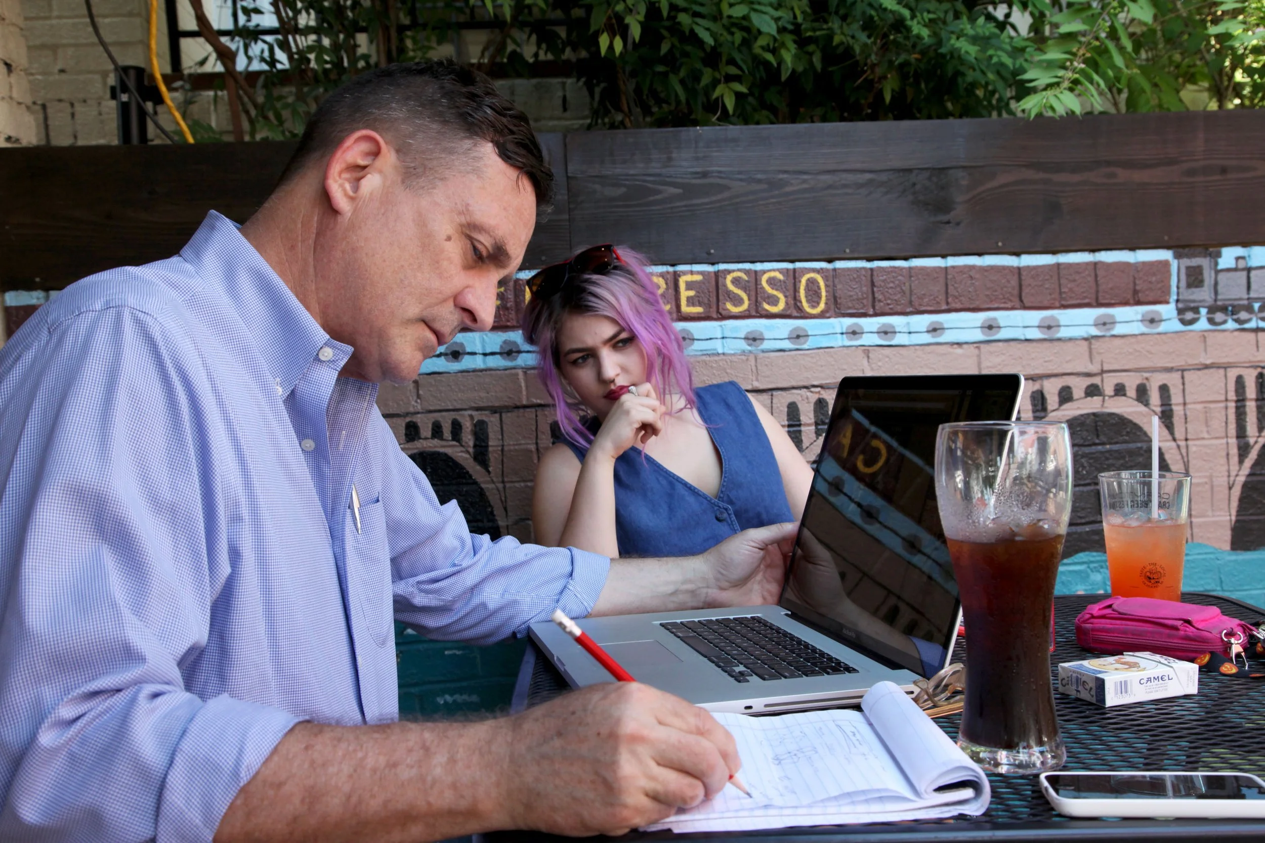
Doug and Harper Lee working outside.

He remembers one of those projects vividly and the finished product alarmed the instructor.
“The assignment was simple,” Doug says. “We had to transform a chair.” Doug’s initial idea was to suspend a chair by guy wires off the side of Chalkley, positioned so that it would be impossible for anyone to sit in it. In the end, he figured it would require too much work.
And then like a light bulb going on in a thought balloon above his own head, Doug had an idea—he would electrify a chair. Not create an electric chair for executions, but actually electrify a chair. He liberated an old oak chair from the Cabell Library, a chair that bore the official seal of VCU’s precursor, RPI. He went to the Sears then at Allen and Broad streets and bought a number of ceramic insulator, baling wire and some good-sized nails. “I nailed a bunch of insulators into the seat of the chair and a bunch of insulators up the ascenders of the back of the chair, and then strung baling wire between them,” he says. He attached the two lead ends of baling wire to the cord of an old lamp, and then plugged it in. “The wire got so hot it just stated glowing, and I left it on for ten or fifteen minutes to see if it would do anything beyond glowing, but that’s all it did.”
So on the day of the critiques, after everyone else in the class had made their presentations, Doug presented his chair, which was sheathed in large black garbage bags.
He asked someone to draw the blinds and turn off the lights. He then unveiled the transformed chair, and with a showman’s aplomb plugged the chair into an outlet. Within minutes, it glowed like the coils of a toaster.
“My instructor started to freak out he said, ‘Okay, okay that’s great,’” Doug says. “And I said, ‘Well, wait a second, wait for it.’ And I took a piece of loose leaf paper and put it on the seat and it immediately caught fire. And he was like, ‘Okay, okay, that’s great. Can you put that out and unplug that?’ So I should have gotten an A on it, but I got a B because my instructor asked me where I got the chair from and I told him I took it from the library. That was part of my budding punk rock persona. I was proud of the fact that I had stolen the chair from the university that was grading me on it. It spoke to shock value and performance and it was smart.”
That persona he speaks of was already being formed while he was in Northern Virginia. He would study the pages of GQ and Esquire for men’s fashion, even worked for a short time at a men’s clothing store. But his personal style was most informed by punk uniforms. “That would mold my sense of style,” he says. “I adopted the skinny jeans and the deck shoes, the slip-ons. Personal style has always been a big deal to me. You develop a look, or you develop a uniform, or you develop a way of presenting yourself. And you throw curveballs into it sometimes. Today, it’s black shoes and boots, jeans and a decent shirt.”
Not long after moving into the dorm, Doug joined VCU’s Concert and Dance Committee. During a meeting while they were discussing the upcoming Halloween Dance, which was going to feature The Ramones, they asked for a volunteer to do dressing room security. Doug’s hand shot skyward.
The night of the performance, Doug was in the bowels of the old Franklin Street gym. “DeeDee’s drawing German propaganda on the chalk board,” he remembers. “Johnny is complaining about not having the right kind of mineral water. It was like watching a cartoon. I was going, ‘Oh my God, these people are real human beings, they’re not the guys on the record they’re the guys in front of me.’”
A one point, Johnny complained about his new leather jacket being too hot. Joey asked to see the jacket. He held it in his hands, brought a switchblade out of his pocket, flicked it open and began carving the blaze orange lining out of the jacket. And then he tossed the tailored leather jacket back to Johnny. “It won’t be hot anymore,” he said.
“I was like stupid, wide-eyed, I couldn’t believe it,” Doug recalls.
And the evening got even better. As fate would have it, that same night on network television they were running a film with Kiss and the Ramone boys wanted to watch it. But there was no TV in the old Franklin Street Gym. “And I was like. ‘Well I’ve got a TV in my dorm,’” says Doug. “And they said, ‘Will you get it?’ So I left there, walked half a block to my dorm, unplugged my TV, carried it back to the gym, plugged it in and said, ‘It’s black and white.’ It was a little black and white TV. It was this pivotal moment. Any intelligent person knows that the people on the records are just people. But to actually experience that with these guys who were such cartoon characters. And then of course I watched the show from the side of the stage which makes you feel really cool. That was the first live punk show I ever saw.”
There was something about that night that was also pivotal for Doug. “I did a flier for the Ramones show and it was my first paid gig,” Doug says. “The CDC (Concert and Dance Committee) gave me fifteen bucks. That was my first design job. I’m not proud of the way it looks at this point in my career.” But he does have it squirreled away somewhere, because all four of the Ramones (Markey in the place of Tommy) signed it.
Life began accelerating and everything seemed to dovetail. He had his sense of style down, personally and politically, knew how to look and act a certain way. He had found his music and became somewhat of an authority on the subject. He produced hundreds, maybe even thousands, of playbills for punk bands over the years. He became a sort of guru to other aspiring graphic artists and punk rockers. This, too: People just loved him. Men and women alike.
During the second interview session, as I set up the microphone on the coffee table between the couch and Doug’s chair, Harper Lee, his daughter, enters the front door. Like her father and mother, Liza Corbett, Harper, who’s still in high school, has already found her style. She does a little modeling for Blue Bones Vintage. Harper leaves us and heads up to her bedroom.
“I have a personal style,” Doug says. “And if I can get abstract for a minute, it’s a personal brand and my Facebook persona is not me. I don’t bitch and moan about stuff on Facebook, like relationship stuff or money troubles. It’s very unattractive. I will quote Fran Leibowitz, who said: ‘Spilling one’s guts is just as unattractive as it sounds.’ If you’re one on one with somebody having a conversation and the natural progression leads to that, that’s two people having a conversation and that’s important in life, but to share something wholesale is just not my style. It’s a personal style that’s developed into a brand. There’s a separation between me and social media. On social media I have a brand and I present myself in a certain way. I’m clever and attractive and funny and politically aware and I share what I think is pertinent to people I care about.”
When I ask him about the Dutch angles he employees when shooting photos of just about anything, he grins. “It’s a cheap trick,” he says. “I learned it in college. But seriously, I can give you a lot of reasons why I shoot photographs on an angle like that. It’s a shorthand, because if I take a picture of a building and if it’s not squared up exactly right it drives me crazy as a designer. If I put it on an angle, it’s a different animal. I can adjust it. And I like to fill the corners, and if I shoot something square, there’s a lot of wasted space.”
Not long ago he gave a couple of images to a close friend of his and she hung them on her wall on a diagonal like a pair of diamonds. “It really opened my eyes to how I look at the images that I’ve already been taking on an angle,” says Doug. “I see them in the camera and in my head as a lozenge shape, and that’s how they’re supposed to be looked at.”
Doug would leave VCU a semester shy of graduation, and he wouldn’t look back. Eight years after he left VCU, his father generously offered to pay for his final semester of schooling, but Doug declined. He was a seasoned graphic artist by then. “I think of myself as a graphic artist more than a graphic designer and more than an art director,” he says. “Because I look at graphic problems more as art than as commerce. And it’s important to me that people look at what I’ve designed and go like, ‘Wow, it doesn’t just do what it’s supposed to do, it goes beyond that.”
Over the course of his professional life, Doug has used every technique imaginable in his graphic art.
“I bridge a lot of gaps,” he says. “In graphic design I saw old school. I even set type at one time when I worked at the Men’s Clothing Store up in Northern Virginia. I worked in the warehouse and asked if I could make the signs. They had a press; it was awesome. So I got to work with moveable type. I reveled in the process of it, getting ink on my hands.” He used letter press and stencils, cut and paste with waxed strips of lettering. It was a successive chain, each link moving him forward with the latest technologies.
Over the course of his career, Doug has worked in virtually capacity as a graphic artist and designer, and from each position he learned a trick or two of the trade.
“I'm proud of all the publication work I've done over the years,” he says. “Besides North of the James, there was Throttle in the eighties, all the pubs I got to work on at the VMFA when I was just starting out, Style Weekly, and my stint as art director at Richmond Magazine.”
“At Thalhimers, using wax machines and paste up informed my later work and informs my work to this day,” he says. “Nothing is cemented until you burnish it down. And even then you can still fiddle with it. And I still kind of think that way on the computer. Disparate objects that you’re moving around. It’s an easier way to work, but it’s still the same concept. You set your type, you choose your font. In old school paste up, you would cut out individual words and letters and kern them and track them differently, and that’s much simpler on the computer, but it’s the same outcome.”
When he talks about his days at Richmond Engraving, it sounds almost like an apprenticeship. “I learned more at Richmond Engraving in six months than I learned during the entire time I was at VCU,” he says. “And that’s not disparaging VCU. It’s about process and taking an idea to its finished form to go to print. When I worked at Richmond Engraving I did a little airbrushing, which was like old school Photoshop. I learned tricks about different exposures and flashing and bringing up focal points in photographs.”
We move to the highest tier of graphic art—the logo, a sort pictoglyph that unites words with images, where the picture is worth a thousand words, and the word is worth a thousand pictures.
“Less is more,” says Doug. “Simplicity, boldness, color, immediacy, and, maybe, dynamism.” He mentions one of the most recognizable logos in history, which was designed by the same man who created the New Haven Railroad logo that so fascinated Doug when he was just a boy. “Look at Paul Rand’s IBM logo,” he says. “He pared everything down to three letters, which is what the company is, and made the letters out of bars that spoke to movement and somehow abstractly to computer paper and things like that. But it’s so goddamned bold and beautiful. It’s blue and it’s so strong and so bold.”
And then he talks about another logo. “Coca-Cola, the color branding, and the script that shouldn’t work, but works,” he says with enthusiasm. “It’s worldwide now and it’s immediate. You can see a fragment of a Coca-Cola logo and say, ‘Oh it’s Coke.’ The top curve of the C that arches, it’s insane and it’s beautiful. It just shines like nothing else.”
Along with the word and its typeface, the other key element in truly successful log creation is color. “You have to limit your palette,” Doug says. “And that’s true for design in general. You have the entire spectrum to choose from and you have to limit it to two or three colors. A couple complimentary colors and then a tertiary color that complements them both or works against one of them for effect. That’s where you want to be. Because your eye doesn’t want to jump around the page, your eye wants to see a cohesive whole, and limiting the palette tends to do that. I call it separation. If you have too many things going on, you have to go through certain layers to get to the message. And that’s not right. The message should be immediate.”
Doug mentions a handful of logos he designed that bring him great satisfaction when sees one out of the corner of his eye. “There's the joy of wandering around town and seeing my logo work out there,” he says. “Kuba Kuba, Artworks on Hull Street, Deep Groove (Records), James River Family Dentistry out in Bon Air, my Red Army logo at City Stadium. Seeing my for sale signs around town for Chris Small.”
One of his greatest joys from the very beginning has been designing record packages. “When I was growing up I wanted to design album covers and T-shirts,” he says. “All of the records and CD covers I've been asked to design over the years, The Dads lost album, Loincloth—my first metal logo, the work I've done with Bio Ritmo, the new Miramar CD . . . what an honor. And the body of work I’ve done with the band Honor Role. It was an amazing partnership with four musicians who gave me full reign to do whatever I wanted to do. They let me interpret their band and their music visually. Two albums, three singles and then a compilation CD. All their fliers. There’s a big body of work that I recently packaged and will start selling as soon as I get my website up and running.”
At times, Doug seems almost fearful that he is tooting his own horn a little too loudly. “The irony is I’m in the promotion business and it’s difficult for me to promote myself,” he says. “There are certain people in town that are really successful at things they do and they’re not very talented at it, and I will not name names. But they’re good at self-promotion and they’re good at worrying people, and I mean this in the Southern sense, to do what they want them to do, and I find that really unattractive and I find that really unethical.”
As with many of us, Doug feels a certain unease with the political events of recent years, and he frequently produces graphic art to combat ideologies that are opposed to certain freedoms. “I get pissed off about something and I’ll do this thing and it will go viral and it’s fun and it’s lovely and then it scares the hell out of me,” he says. “There have been a couple of things I’ve done on line that have gotten shared and gotten picked up by boingboing and then you’re out in the arena of the world. If I go back and read the comments on this stuff, it’s frightening.” So he stays away from that sort of thing because he knows what can happen. “I know the woman that painted Donald Trump with a micropenis got her ass kicked by Trump supporters,” he says. “So I do things anonymously for certain radical groups that I’m friends with, but I purposefully do it anonymously because I don’t want my name attached to some of the more radical things I do. The political stuff is really important to me. There are certain things that I find unconscionable like the NRA and Trump supporters and homophobes and misogynists and people that want to impose their political views on other folks. That’s why I do graphic work for the Alliance for Progressive Virginia.”
A knock comes at front door and Harper answers it and leaves with a friend of hers. Doug moves up in his chair toward the microphone and speaks very softly now. He tells me that when he met Harper’s mother, Liza Corbett, it was truly love at first sight and first sound.
Doug and Liza separated about four years ago, but through it all they have managed to keep the world safe and constant for the product of their love—Harper Lee Dobey. “The fact that it’s me and Harper is very, very important in my life,” Doug says.
Doug Dobey is at the top of his game. His work is in constant demand, and his platter always full. “I’m lucky that I’m as busy as I am,” he says. “I do real estate work, I do logo design after logo design. North of the James magazine is my base and it has been for years. It’s working on something I love that I have a sense of ownership about. I really f***ing care about the magazine, and I love working with you.”
And then there’s this, which is really extraordinary. ”I've done this amazing body of work with Shadetree Sports, all my international cycling work,” he says. “I mean, who the hell gets to work with the Giro d'Italia and top class cycling teams? It's nuts. Just talking about the Giro, one week every summer we turn the entire Titanic Quarter in Belfast pink. Pretty much everything onsite is something I designed. And I'm the guy that tells Northern Ireland where they can and can't park, what roads they can't cross. All those no parking signs. That always makes me laugh.”
He reaches for his Mac, which never seems to be more than an arm’s length away. He opens it like a sacred book and his fingers move instinctively to the keyboard and his eyes to the screen. He touches one key.
“I tweak and tweak and tweak, and at the end of the day it looks like I just put type and an image together,” says Doug Dobey. “Which is everything. The message is there and there’s not static. That’s where all the fussing and nuance and kerning and fiddle ****ing ends up. You see something that’s pure and says what you want it to say without any extraneous information.”
And then this: “If it doesn’t drive the story, you pull it out.”